 Jamie Ryan
23 Feb 2021
A tragic marriage of 'clever' interventions and poor understanding of user needs.
Use of public transport is growing in cities, and is necessary in order to control increasing congestion in cities like Dublin which have not been built in mind with the level of car usage seen today. With Dublin consistently featuring among the top 20 congested cities in the world, it is clear the city needs to be reconfigured to reduce single-person, inner city car journeys. With some serious funding and consideration being made for larger cycle routes in the city (and the infrastructure of said cycling routes a whole different story…), it’s a chance for a service for Dublinbikes to really grow, gain much-needed profit and become a part of a new cycle culture.
Dublinbikes is a public bicycle rental service which lets users pick up a bicycle from a Dublinbikes station, ride, and park at another station. These bicycles are available for shared use and intended for short-term trips, typically for inner-city trips. These bikes are locked, but can be unlocked with a membership associated with a user’s Leap Card (prepaid public transport card). These subscriptions can be bought at any station or through the Dublinbikes website.
For the purpose of this article, I’m going to be looking at the website experience to figure out what works and what could be improved.
The Problem
Dear jamie, Your dublinbikes annual subscription is due for renewal on 13-Mar-2021. We would like to remind you that unless you wish to unsubscribe from the NOW TV dublinbikes scheme your account will automatically be renewed and you will be charged the re-subscription fee of €35 (previously €25).
I like when services are honest with their intentions, particularly when it comes to purchases. In a world increasingly dominated by the new wave of UX — ‘User Exploitation’ , where dark patterns are aiming to confuse users in order to prevent losing them, it’s nice to get something as simple as a reminder like the above.
I received this email a few days ago, and remembered the time I ended up paying for a Dublinbikes subscription having never used it all year. Of course, I had forgotten I had even subscribed to Dublinbikes — I had been a regular user for a few years when living in the city centre, but had since moved out of town, so it was a nice reminder to cancel my sub.
So, this was to be a simple follow-the-link and click unsubscribe right?
Not exactly.
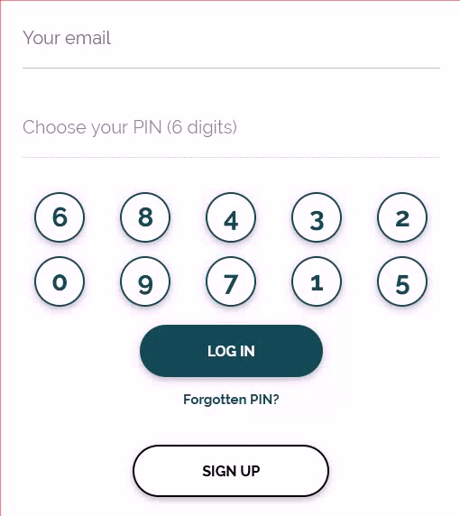
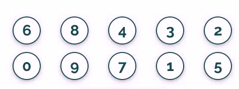
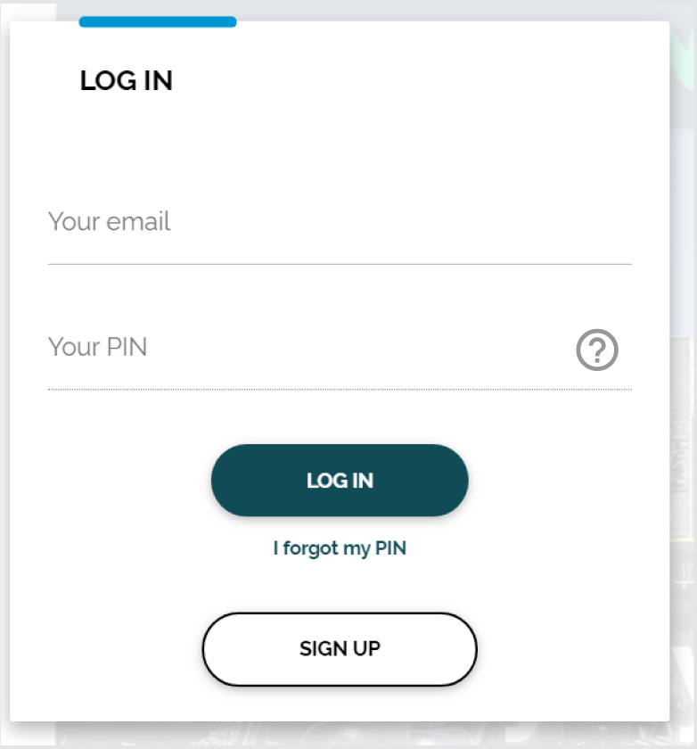
When I came across the login screen, I wasn’t really processing what I was seeing, and proceeded to enter my email and my PIN. An ominous looking ‘no entry’ cursor appeared as I tried to enter the PIN, and I realised I had to use the on-screen buttons to enter my PIN. What was likely a well-intended secure login, comes across as needlessly complicated and frustrating, a cryptex of sorts. If anything, forcing a user to slow their input to careful presses makes it more visible to onlookers. Creating an unfamiliar keypad layout has accessibility ramifications for every kind of user. It’s just… wrong.
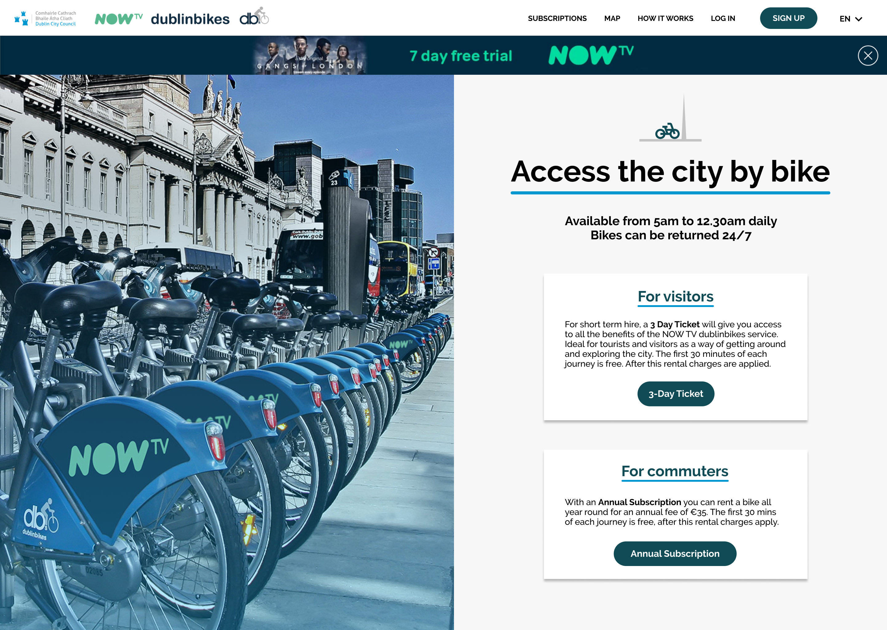
The Landing Page
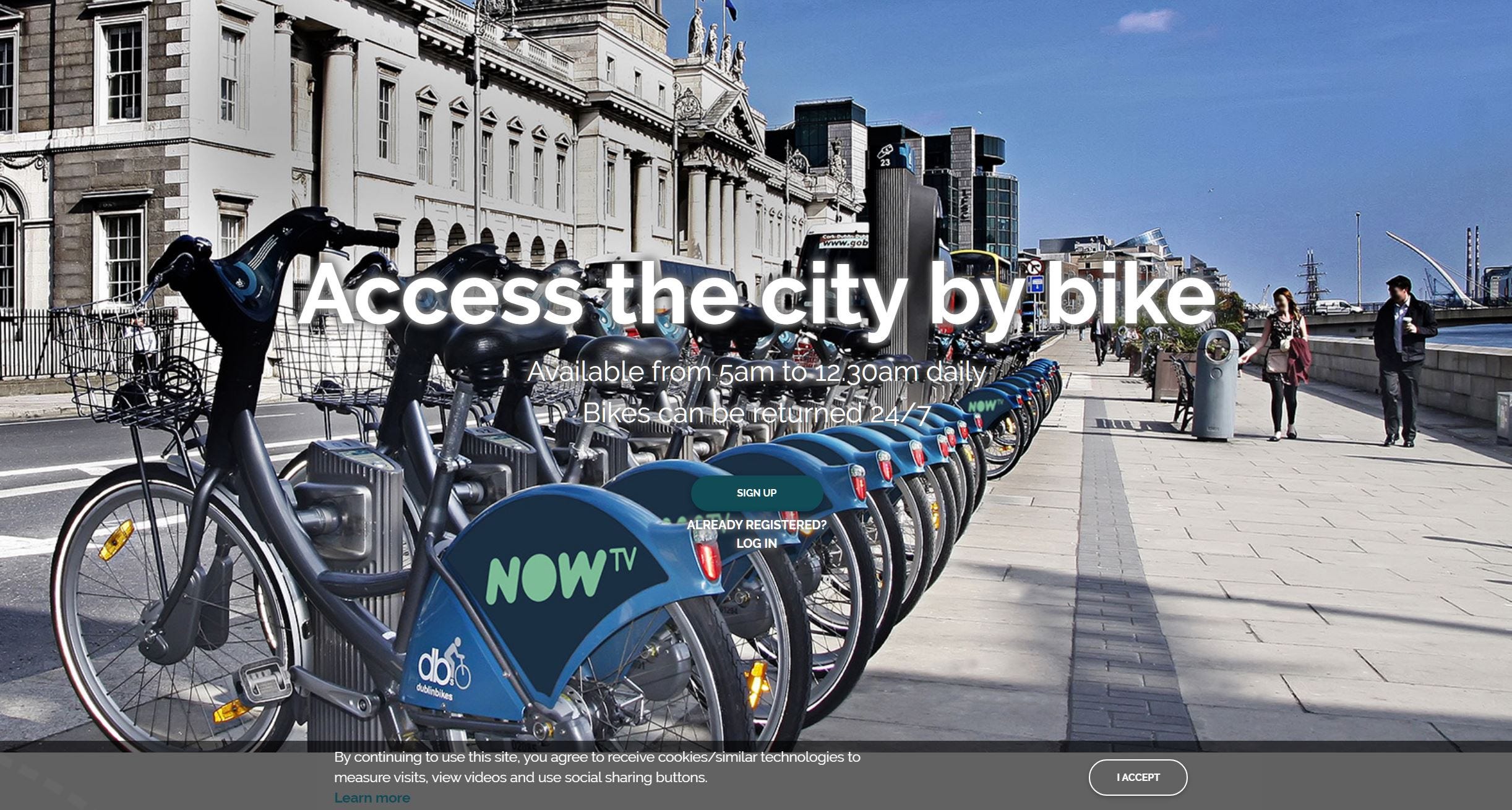
First impressions matter immensely on the web. It took me some time to figure out where I could login to the page. There’s a big headline and something below, but it’s camouflaged by the full-screen, brightly lit image of the bikes. Unfortunately, it’s the same in mobile view. While the image gives you a great idea of what you’re in for, there is a sense of being lost on what to do next. The top nav bar for the site does not appear until the user has accepted cookies and refreshes, or navigated elsewhere on the site then returned to the home page. If I were a new user with little patience, this is about the time I’d try search elsewhere for information.
Contrast issues appear throughout, with the signup/login options barely visible on the bottom navigation either. Now I’m not just confused — I’m irritated.
The navigation itself has some inconsistencies. The login button is the profile icon, but this icon isn’t immediately apparent due to the lack of contrast and placement between the logo and language selection buttons.
Speaking of language buttons — this English button does nothing. It’s clickable, but nothing happens on clicking. I’ve tried editing the URL to see if there are indeed other languages available, and this leads to 404s. At the very least, the service should be offering Spanish and French options in line with the kiosks at the physical docks.
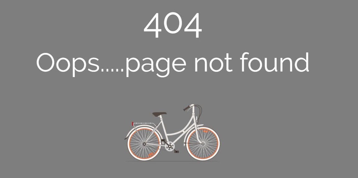
The 404 could be a little more imaginative — it doesn’t even show the bike that the service promotes, opting for a generic image. Worst of all — all forms of navigation disappear! Leading users to dead ends is not only disorientating, but potentially disastrous if they’re using the likes of a touch interface which may not have a back button available.
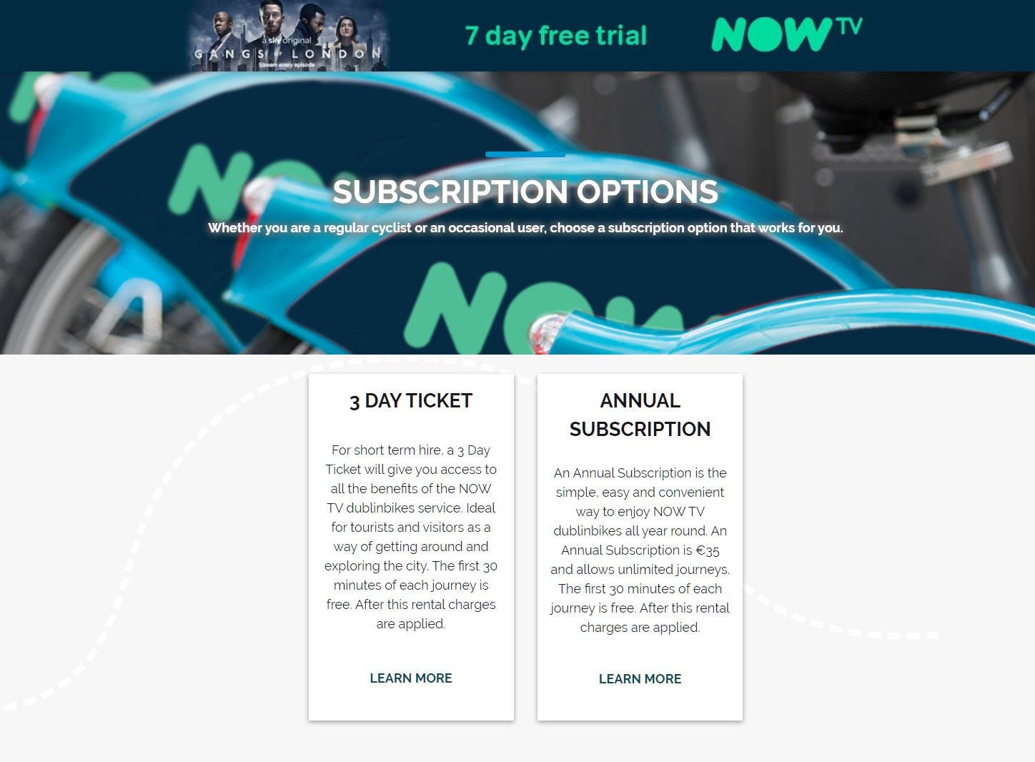

The subscriptions page — one of the most important for acquiring new revenue, is presented haphazardly, with the only 2 types of subscription available being presented like Matryoshka dolls. If a user were hesitant as this point, you may have already lost them.
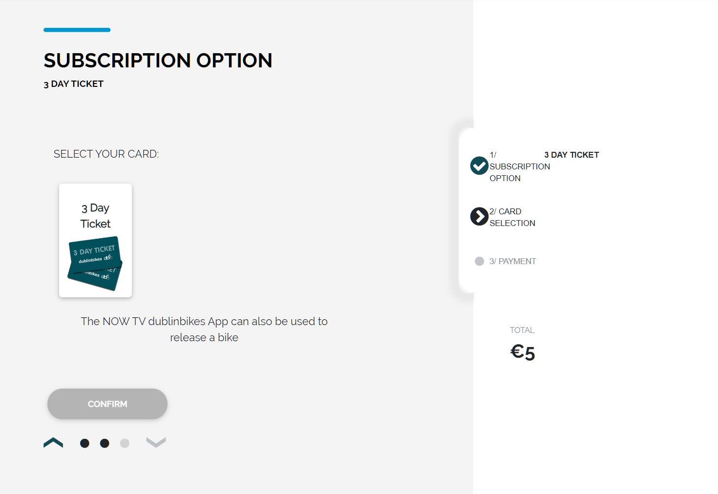
The payment process feels unfinished and scattered, and as a user, I’m hoping my payment data has been handled with a greater competence than this page suggests. The tone of voice is irregular — I’m not sure who’s talking to me, but they seem to be erratic, sometimes excitable, sometimes inanimate.
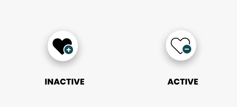
That’s not to say the site is without good functionality — the Maps and How It Works pages offers a pretty decent overview of the service, with a functional interactive map with available bikes and stands at each stop available. A favourites and bike review feature is available on the map, however it’s unclear whether this feature is useful to anyone or why it is there. Sometimes, less is more. Worst of all, the favourite icons go against virtually every known convention of an active state of a filled heart, with the selected favourite becoming an outline.
Quick Suggestions
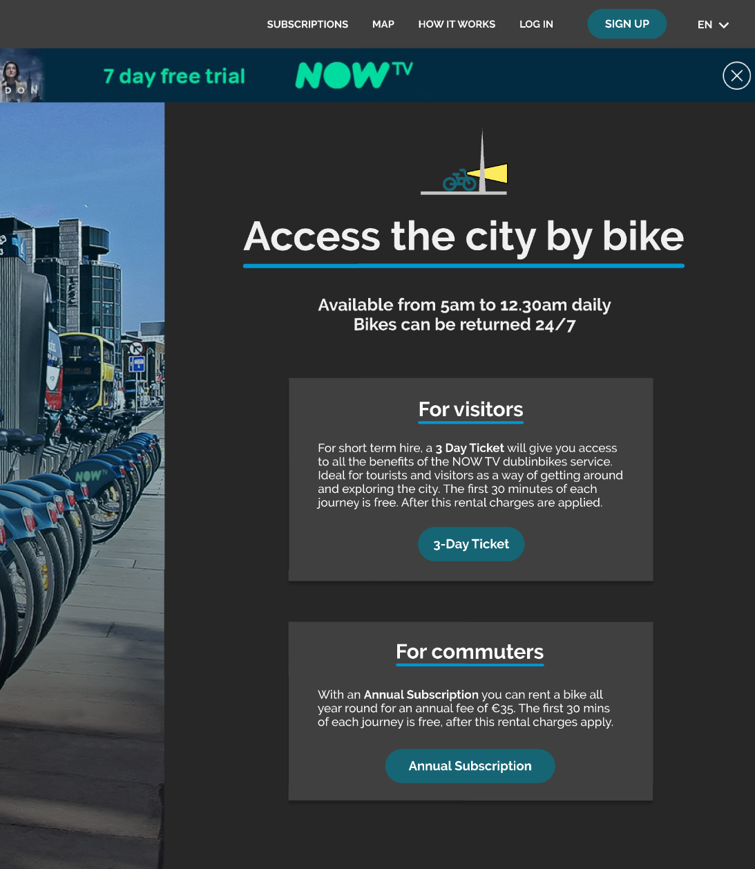
Here’s a quick design sketch of some proposed changes to the landing page based on what I talked about above. The idea is to make the website a portal for visitors to sign up to the service and prioritise new subscriptions.
Fix The Login
The login PIN input feels like a brain teaser and creates frustration. The fact that it actively disallows a text input feels like it is deliberately creating friction, and makes any accessibility layers useless. The solution is simple — just use what everyone knows. The text field could be substituted for a 6-box PIN entry too, but again — why complicate? Adding in a help dialogue to find this PIN as well as a more standard terminology would make this easier.
Create Consistency and Identity
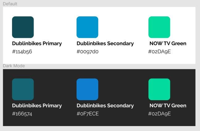
From browsing the site, the impression is there is a primary and secondary teal colour that represents the visual identity of the brand, in line with the colours on the bikes. However, this is rarely consistent on the site, with varying approximations on every page. Font sizes and families also vary wildly, giving the sense that the page has been developed at different stages by different people without consideration to what came before. A basic design system is an easy way to solve this problem and ensure that elements are consistent across the site. I created some basic colour identities to outline my point.
Get to the point
Reducing friction and offering immediate paths to the user goals should increase conversion. Offering subscription options on the landing page gives people an immediate opportunity to get their pass. A clearer login and signup button makes it easier to get to account details. Moving important information and secondary information into clearer hierarchies means fewer clicks and less time spent hesitating or at worst, giving up.
In Conclusion
I love Dublinbikes because it offers a service to make the city less reliant on unnecessary single-person car trips. With more consistent government-level funding paired with less reliance on visually unappealing advertising as a primary funding source, the service could become something that is synonymous with life in Dublin, much as cycling is synonymous with Dutch living.
Users expect sites to be clear, direct, and frictionless. Public state-owned services in particular need to understand the return on investment that good design brings to their digital experiences. I think something as simple as a low-intervention redesign of touchpoints such as websites or kiosk interfaces can dramatically increase uptake and usage of a service, thereby generating more revenue for future growth. Happy cycling!
This is my first design article, and I’m planning on writing more! It’s been nerve wracking putting my thoughts out into the ether, but adopting a beginners mindset makes it easier to let go of the worries and embrace uncertainty. As Alexa Shoen reminded me, it’s better to just post the thing than imagine an impossibly perfect work! I’d love any feedback you have.