 Jamie Ryan
07 Feb 2023

This guide is part of (an eventual) set of three that aims to break down Auto Layout, from basics to advanced usage. Content will be refined and changed as I flesh the content out and receive feedback.
Auto Layout gives designers a limited but useful implementation of the CSS flex layout system to play with, and if used right, exponentially speeds up design work and increases flexibility with component usage and layouts.
- Before you begin
- What is Auto Layout?
- CSS Flex and Auto Layout
- Are Frames Dead?
- Creating an Auto Layout
- Auto Layout Panel
- Important Considerations
Before you begin
It’s highly recommend you supplement your learning of Auto Layout with CSS Flexbox - not only will this help you instinctively understand how Auto Layout works, it will mean that your knowledge of Flexbox can be applied to any future design tool, and we know tools aren’t forever.
A really fun way to learn the basics of flexbox is with the fantastic game Flex Box Adventure.
What is Auto Layout?
Released in late 2018 as an adaptation of CSS Flexbox, Auto Layout is one of Figma’s most powerful tools, making dynamically sized content and layouts a breeze compared to the pixel-perfect dragging-and-dropping of the past. Countless hours have since been saved by designers not needing to completely rework a layout if a single item needs to be removed from a complex layout.
For example, instead of creating a fixed button width, now the width can hug the text within, or fill the width of a parent container, just like in code. Layout of items can be edited with ease using set spacing constraints, and content can be automatically stacked in layouts of rows and columns, hence Auto Layout. Content in Auto Layouts is moved by an intuitive ‘snapping’ interaction inside their layouts, which is to this day, Figma’s most satisfying interaction.
Auto Layout is still expanding with additional alignment options for all kinds of use cases. While not offering the full flexibility of its CSS counterpart, such as breakpoints and flex-wrap), building with Auto Layouts is one of the core skills every Figma user should master.
CSS Flex and Auto Layout
In many ways, Auto Layout aims to match the functionality of the popular CSS layout system Flexbox. I will be making reference to CSS counterparts when describing Auto Layout properties. Not only will this aid with design-dev communications, it means that time you’ve spent learning this tool won’t be wasted if Figma goes pear shaped. Tools should facilitate your skillset, not define it.
Are Frames Dead?
I theorise that every Figma user who discovers Auto Layout completely does away with Frames briefly, and will inevitably discover that Frames are still just as valid as they have always been in screen construction in Figma.
Auto Layouts are essentially, a dynamic Frame and still recognised as a frame ‘of sorts’, albeit without some freeform alignment properties of Frames.
Frames are still an important tool when defining your viewports. When it comes to fixed viewport sizes, we want something rock solid that we can use as a reference for all child layers.

Without frames, we can’t easily set fixed elements without setting clipped layers and awkwardly resizing content frames. Frames handle this much better and will automatically resize the frame height in prototypes. We can still edit a full length Frame without any issues displaying it in prototypes. This works great with the template device sizes.
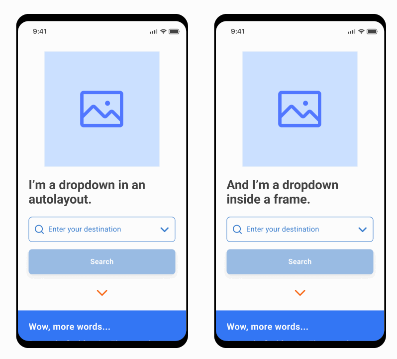
Note, on the autolayout, the dropdown knocks down other content. On the frame, it stays fixed.
Overlaying interactive content such as dropdowns won’t work in pure Auto Layout, either pushing other content out or ducking under other elements. With Frames, we simply place this above other content and it will correctly render over existing Auto Layouts. We can also independently change the layer ordering without forcing content to re-order, as Auto Layouts display content based on their layer order.
Think of Frames like a big sticky overlay, that everything underneath can stick to without snapping in place. - even Auto Layouts need something static to hold onto as a point of reference - both Frames and Auto Layouts can work together to create powerful layout options, if you understand their limitations and where they work best.
When you want to define top-level fixed content and viewports, use Frames.
When you want to define flexible content, use Auto Layout.
Basic Principles of Auto Layout
Creating an Auto Layout
The magic shortcut for creating an Auto Layout is Shift + A. This will make your selected element a child of that Auto Layout.
- If the layer is a Frame, it will be converted into an Auto Layout..
If you’ve made a single element an Auto Layout, some default constraints for padding and spacing will be added based on your Big Nudge amount, and the alignment will be top-left by default.
If you’ve selected more than one element, Figma will try to guess your spacing and alignment setting based on where these elements were originally placed. Bear this in mind, tweaks may be needed.
An Auto Layout layer can be identified by a unique ‘three bars’ icon on your Layers panel. This also provides a clue as to what direction this Auto Layer uses (which we talk about in Constraints).

Auto Layouts can be styled much like Frames can, and can also contain a layout grid, if you’re into that sort of thing. Be careful though - you cannot set traditional Constraints that Frames use, such as "Left".
If you’re a web person, think of an Auto Layout like a div container with the display:flex property.
Auto Layout Panel

When an auto layout frame is selected, the following properties display on the right hand panel (displayed with their relative CSS properties:
- Container resizing
flex-grow, width - Auto-Layout direction
flex-direction - Space between items
gap - Padding
padding / margin - Align
align-items
Container Resizing
On every Auto Layout layer, within the dimensions section of the right hand panel, a horizontal and vertical resizing selection is available, with the option of Hug Contents, Fill Container, or Fixed Width.
This is the bread and butter of Auto Layout and it’s important you are familiar with how these work.
Hug Contents: This layer will shrink to fit the width/height of any child layers.
Fill Container: The layer will attempt to fill the parent layer width/height, while respecting the width of layers sharing that container width/height. If more than two layers are set to Fill, they will share the space evenly.
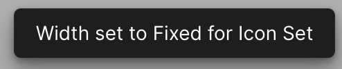
Fixed Width: The content will stay at the defined width no matter, and ignore any other properties.
Hug and Fill are contextual - they need something to reference to. If your layers aren’t behaving as expected, the best course of action is to start from the innermost layer and think of how you want each layer to behave at each level.
For example, you’ve set your layer to ‘Hug’ but a text layer is sprawled out across one line and causing your whole layer to become super wide. You may need to set your text layer to ‘Fill’ and your parent layer to ‘Fixed’, so the text layer has something to refer to. As you practice more with constraints, you’ll understand them better and be able to manipulate them with ease.
Auto-Layout Direction
Sets the direction which items of the auto layout frame stack.
All auto layouts stack items as either a column (vertically) or a row (horizontally)
Space between items
Sets the spacing between each item of the auto layout frame.
If the spacing mode is space between, this will display as Auto. More on this below.
Padding
Sets the amount of space around the auto layout frame (not the individual items).
Figma treats CSS margins and padding in a more simplified way, so you may need to communicate spacing clearly if sharing with developers.
By default, you can set horizontal and vertical padding. You can also set independent padding values using the Individual Padding button (looks like a dashed circle).
Align
This determines how items in the auto layout should be aligned, if they have space to move around. If content (including padding) already fills the Auto Layout, you will not see a change.
Watch out for tricky alignment issues if layers are flipped. You'll notice the align preview behaves 'backwards' and this is usually the cause.
Advanced Layout Settings
There are additional options within the Advanced Layout Settings (…) menu:
Spacing mode: This contains two options, which can also be toggled by clicking the alignment box and pressing the X key:
-- Packed: Auto Layout items stay beside each other with the gap value between them.
-- Space between: Auto Layout items will automatically space evenly, which changes the gap value to Auto.
Strokes: Defines whether strokes are included or excluded in the auto layout. This will only affect either external strokes on child layers or the stroke of the auto layout layer. Useful if strokes are affecting your measurements, but in most cases, you don’t need to worry about this.
Canvas stacking: If you have overlapping elements, you can set them to stack as First on top or Last on top. This doesn’t affect the layer order.
Text baseline alignment: This will attempt to align objects by their text layer baselines - very useful if your text layers are not optically centred, even though you used centre-alignment.
Absolute Position: When a child layer in an Auto Layout is selected, an additional option appears in the Dimensions panel, Absolute position (which looks like a {+} icon). This behaves just like position: absolute in CSS - if you select this property, the layer can be moved independently inside an Auto Layout, as if it were in a Frame. Additionally, it receives Constraints, which respects the parent layer. The icon for this layer will also change in the layers panel, which you can use to diagnose issues if a layer isn’t behaving as expected.

There are cases where absolute position makes a lot of sense within the context of an Auto Layout, such as an “X” button in the corner of a modal, or a corner badge which extends beyond the borders of the parent container. Note, that other layers will now ignore the position of this layer.
Important Considerations of Auto Layout
Shift + A will always create a new Auto Layout, even within itself.
It’s not a toggle, so be careful not to create a ‘stairway to hell’.
If you remove a key reference constraint, or two layers reference each other in a way that’s impossible to resolve, Figma will resolve this conflict by changing a constraint automatically.
For example, if child layers are set to Fill, and the parent is set to Hug, this creates an infinite loop, so it’ll resolve one or the other to create a point of reference. Don’t worry, you’ll get a notification that this happened, so that you can identify and fix any issues. This is important to watch out for as you correct multiple levels of layer constraints.
An auto layout layer can’t Fill Container if there’s no container to fill.
If you have an Auto Layout in a frame, it won’t recognise the Frame as a container - you’ll have to use Fixed Width to create a reference point. Generally, if you have a mixture of fixed and scrolling content inside a frame, keep your scrolling content in an Auto Layout, and your fixed layers separate, and size the top AL container to your viewport.
Auto Layouts aren’t perfect - you’ll still need to resort to static examples that accommodate max-width or flex-wrap properties. This is why understanding how a CSS implementation is key in freeing yourself from Figma’s own limitations so you design for the real world. You can create variants or static representations of these effects and use code terminology to prompt developers.
If you need to revert an Auto Layout back to a Frame, you can use the minus (-) icon beside Auto Layout on the right hand panel, or use the shortcut Opt/Alt + Shift + A. You can also dismantle the Auto Layout by using Cmd/Ctrl + Shift + G.
Design Exercise
Create a button and icon combo as a row. Try styling the auto layout - now you don’t ever need to create a dynamic button as a ‘Rectangle’ element again! Play around with alignment, spacing, and padding options.
Create a mobile navigation bar using 3 icons - explore spacing and alignment options and see you can create something that is responsive to different design sizes.
Try Absolute Position to place an X button on the corner of a modal which otherwise contains content in a vertical stack.
Extra tips
In cases you need to set the sizing constraints of all child layers in an Auto Layout, select the AL layer, press Enter to select all child layers, and then set your properties to affect all layers.
Sizing shortcuts:
- Set to Hug - Double click layer boundary
- Set to Fill - Opt/Alt + double click layer boundary
- Set to Fixed - Drag layer boundary
Toggle Packed and Space Between spacing by clicking the alignment grid and pressing the X key, or setting the spacing value to “a”.
- You can tell what spacing mode you’re using by the separation of the three bars in the grid and the spacing value (
Autofor space between) - You can set a negative spacing value, when you want overlapping elements. Don’t forget, you can set the stacking order in Advanced layout settings (…).